User Interface
The user interface of the LayoutEditor offers outstanding usability as well as high productivity. This is achieved by extensive use of shortcuts and mouse buttons/keys in combination with clear visibility of these shortcuts. The most important handling functions like zooming and scrolling are integrated into each feature and need not be called separately. Context menus are available for most parts of the user interface by a right mouse click. A three-button wheel mouse is recommended for effective use, but it is also possible to use any feature with a touchpad or one-button mouse.
The user interface of the LayoutEditor is highly adjustable. The default appearance only includes the most important parts. Further toolbars and sub-windows can be added on-demand via the main menu or via a right-click in the empty area of the menu bar/toolbar. The availability of some toolbars/sub windows depends on the LayoutEditor version you use. Features not available with the installed license key are not displayed.
The parts of the user interface are described next. It will start with the most important part of the user interface, the main drawing:
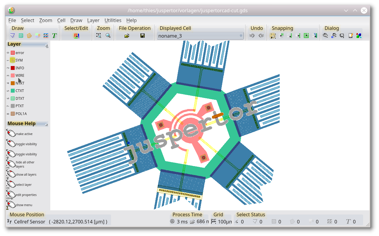
Main Drawing
The major area of the user interface is used by the drawing. The design is displayed here. All graphical editing is done inside this part. But also any menu feature can be called from the drawing part, either by shortcuts or the context menu. The mouse function depends on the activated mode. But three basic features are always active:
| mouse button allocation | |
|---|---|
 |
right-click the drawing to open the main menu and/or context menu |
 |
hold the right mouse button to scroll with the mouse |
 |
use the mouse-wheel to zoom in/out; you will get a fine zoom if the mouse wheel is used together with the Shift key, and a very fine zoom with the Control key |
The background color of the drawing area, mouse pointer, etc. can be adjusted with the Setup Dialog.
Layer Controls
Via these buttons, the display of the drawing is controlled. Visibility, color, fill-style, etc. are set with these buttons. All the setup can (like any other feature) also be done via the main menu or the context menu of this sub-window. The appearance of the layer window can also be controlled via the Setup Dialog. A block view or a list view is possible as well as different sortings of the button. The most important mouse functions in the layer control are:
| mouse button allocation | |
|---|---|
 |
left click to make layer active |
 |
leftclick and hold to display a menu with all options for this layer |
 |
left/middle click and shift to toggle visibility of a layer |
 |
left click and ctrl + shift to edit layer properties |
|
right click to show a context menu. Via the context menu you can also change the view of the layer window itself. For further setups, please use the Setup Dialog. |
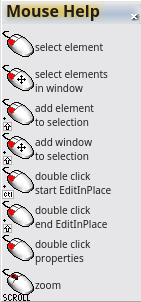
Mouse Help
The mouse-help sub-window shows the allocation of all mouse buttons with the current mouse position. The mouse help window will be adjusted as soon the mouse is moved on another part of the user interface. The allocation of the mouse buttons is displayed by default in the lower left of the user interface. If the sub-window is closed, you can reopen it by a right-click in an empty part of the toolbar or menu bar and activate Mouse Help in the list of available windows/toolbars. Moving the mouse to the mouse help window a dialog with search features is shown (available in the full version only).
Following mouse buttons modifier combinations are used:
| mouse button: keys: |
no | left | middle | right |
|---|---|---|---|---|
| no | |
 |
|
|
| shift | |
 |
||
| control |  |
 |
||
| altl |  |
|||
| shift+control | |
|||
| mouse move |  |
 |
|
|
| mouse move+shift |  |
 |
||
| mouse move+control |  |
 |
||
| mouse+shift+control |  |
|||
| hold mouse button | |
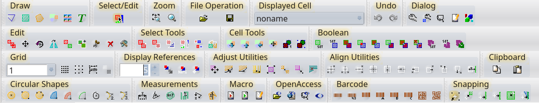
Tool Buttons
The toolbars are placed above the main drawing. Most functions are accessible directly via a tool button. However only the most common tool buttons are displayed by default. With a right mouse click on the toolbar area, a menu with all available toolbars is displayed. After the program starts, the last used setup is recovered. A custom made toolbar can be added by a macro. Help on the individual buttons is accessible through the "What's This" function (Shift+F1). The visibility of the different toolbars can be adjusted via a right-click on a free place in the dock area. Some tool buttons are multi-tool buttons. The exact feature can be adjusted by a middle mouse click on the tool button.
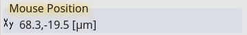
Mouse Position Indicator
The mouse position is displayed in the bottom-left corner of the main windows. Depending on the current editing step additional information, like the operation progress, is also shown in this area. With a right mouse click on the area, you can adjust which units you wish to display coordinates to the user.
Grid Indicator
In the footer of the main window the grid indicator displays the current grid setting. By default, the grid is handled automatically. A grid setting in multiples of 1, 2 or 5 is set with a good resolution for the current zoom level. To manually set a fixed grid, left-click the mouse on the grid setting and enter the required grid. With a right-click on this area, you will have further options to set the grid or to disable the grid. Also, the option to display an additional scale is available.
Select Indicator
The select status in the lower right of the main window shows the current statistics on the selected shapes. With a left-click on one shape type, you can select or deselect all shapes of this type. A right-click on the status will open a menu with more options to select and deselect.

Process Time Indicator
The time indicator is a status display in the footer of the main window. It will show the time required to display the design and the operation time of major editing features. With a right-click on this status, a menu will open with different options to influence the display speed. Most important here are the paint details. By default, the display performance is measured and in case of low performance, the level of the detail is reduced. This may mean that shapes smaller than a single pixel will no longer be displayed or referred references will no longer be displayed. The depth of display reference can also be set with the context menu item display cells.
Shortkeys
Nearly all functions can also be accessed via shortcuts. The shortcuts are displayed next to the menu entry of the corresponding feature. You can also view the available shortkey by pressing the "CapsLock" key. This will display the combination of the keys for the associated tool buttons. The most important functions like select and zoom are mapped on number-block. Shortkeys can be changed with a macro. Any changes are not recovered at the next program start.
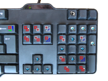
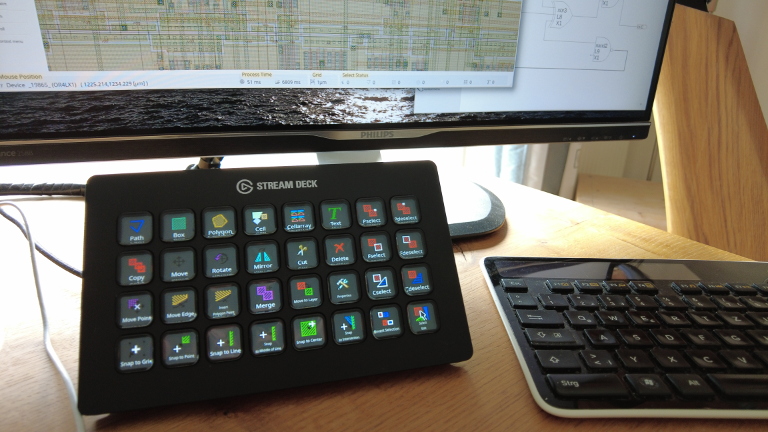
Extra Keyboards
It is not necessary to learn shortcuts because the LayoutEditor supports extra keyboards. The keys will display the icon and label of the features and change with the window. You will have different key assignments in the layout window, schematic windows and text editor. The key assignment is adjustable by the user through script in a similar way as assigning regular shortkeys. An extra keyboard will run with Windows, Mac, and Linux. These keyboard are supported:
- Elgato Stream Deck XL with 32 keys (works with release 20210905 or newer)
- Elgato Stream Deck MK.2 with 15 keys (works with release 20211108 or newer)
Please read the installation manual for the platform specific setup.
Setup Options
The user interface is highly adjustable. Adjustment are made within the setup dialog located in the tool bar and in the utilities menu. All adjustments can also be done by macros.
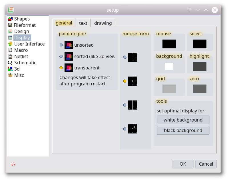
Paint Engine
A paint engine displays the shapes on the screen. By changing the engine the kind of display can be effected. The paint engine can be changed via the SetupDialog. A restart is required before the new chosen engine can be used. Available engines are:
- Unsorted Display: The unsorted engine is the fastest engine. All shapes are displayed with a maximal performance without any calculations on layer order.
-
Stacked display: With the sorted or stacked engine all shapes are displayed in the same layer order used in the 3D view. The highest layer level will be displayed on top. To change the order edit the 3D layer setup in the LayerManager or edit a single layer with the layer properties
-
Transparent Display: With the transparent paint feature, shapes become transparent keeping underlying shapes visible. However, underlying shapes will modify the color. With a dark background, an underlying shape will make its color lighter (darker with a white background).
Mouse Shape
The way the mouse is displayed in the drawing area can be changed. There are four different ways:
- display as a dot,
- display as a cross,
- huge cross over the whole drawing,
- dual display, next to the snapped mouse position, the real position is also displayed.
Display Colors
Color for the background, selected shapes, highlighted shapes, grid, etc. can be adjusted. There are presets for a display with black background as well as for a white background.
Display of Text
Font: The font which is used for all text elements can be adjusted. Any common (vector) font files are supported (TrueType fonts, Type 1 fonts, CFF fonts, OpenType fonts, ...). If no font is selected one of the internal fonts is used. The setup font is also used for the conversation of text elements to polygons.
Iteration: Most fonts contain bezier curves. Most EDA programs like the LayoutEditor don't have elementary bezier curves. So any bezier curve is converted into a polyline. How precise this conversion is done can be set up via the iterations value. A higher value will result in a finer resolution and a higher number of points. An Iteration of 0 will directly connect the start and endpoint without a conversion.
Information Text Size: The height of text that is not part of the design is set in pixels. For example, the size of the text for the ruler or scale.
Display of Drawing
View Cellrefs: How references to cells in hierarchical designs are displayed can be set up here. It is possible to display just the name of the cell, the referred cell or both. It is also possible to select how many hierarchical levels are displayed. If you have a poor painting performance, reduce the displayed hierarchical levels. Furthermore, it can be controlled whether the origin of the referred cell is displayed.
View Text: It can be disabled to show text elements. In that case, only a dot will be displayed. Rendering text is a time-consuming task. By disabling it you will get a faster repaint in case of many text elements in the design.
Ignore Text Rotation: Text elements are always displayed unrotated and not mirrored. This transformation information is ignored for displaying the text. However, it is respected for conversion to polygons.
View Grid: The grid setup.
Surround: The surround setting for EditInPlace
General User Interface
The used language of the user interface is guessed by the setting of your operating system. In the setup, you can choose a different language. Also, the windows style and some other options can be adjusted there. These options include a swap of scroll direction and mouse wheel direction.
User Interface of Layer
The number of displayed layer controls can be adjusted in the layer dock windows. Adjustments can be made in the setup or in the LayerManager. By default, the LayoutEditor starts with 127 layer controls. You can increase it up to 1024 controls. Furthermore, you can adjust how the controls are arranged and sorted. These settings are also available in the context menu of the layer dock window.
Mode of the User Interface
By default, the LayoutEditor starts with the user interface you have the license for. e.g. if you have a full license all features will be displayed. If you have a basic license only feature available with the basic license will be visible. Via the User Interface/Mode setting you can adjust that. A restart is also required to make any changes effective. This feature is especially useful if you evaluate the LayoutEditor and want to check which version fits your requirements.
Adding Tool Bars and Menu Items
Adjusting the menu and toolbar is possible with macros. A documentation for it is in the macro section of this documentation.
© 2026 juspertor GmbH